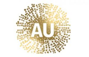
The new logo to market the highly coveted ‘Australian Made’ tag has been widely panned.
Revealed earlier this week, the design – intended to represent Australia’s native gold wattle, has drawn unflattering comparisons. Many have likened it to looking like a virus, or, according to one Lake Macquarie councilor, a ‘generic splash of colour’.
While some reports stated it would replace the now iconic green and gold kangaroo logo, the new design – which came at a $10 million cost to taxpayers, will instead be used at promotional events, such as international trade shows and by government agencies. The existing logo will continue to be used on strictly regulated Australian-made products.
However, even China has weighed in on the design. The Global Times – tied to the Chinese Communist Party’s People’s Daily newspaper, stated the logo would “lead to confusion about Australian goods in the eyes of the outside world.”
In a piece published yesterday, the media outlet suggested “concerns over the loss of the Chinese market share in Australia’s business circles” may have been behind the change, adding that Australia was yet to fully appreciate how valuable the Chinese market is.
And added the logo was a sign of the ‘growing anxiety over its trade prospects amid its deteriorating relationship with China’.
The National Brand Advisory Council, who proposed the logo and are working to create a slick, marketable and modern ‘brand’ for Australia has said the design will see Australia be taken more seriously internationally.

