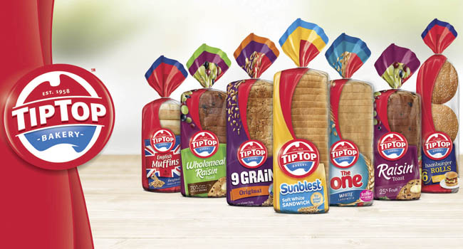
George Weston Foods’ Tip Top brand has undergone a complete redesign, with a new masterbrand as well as new packaging across the entire bakery range.
Lead by Sydney-based design agency, Saltmine Design Group, the objective was to modernise the iconic 50-year old brand while still maintaining its heritage.
To do this, Saltmine shifted the colour palette to richer tones, update the typography, and enclosed the map of Australia within a lozenge device to create a bold brand stamp to reflect Tip Top’s strength and pride. The ‘established in 1958’ credential was added to support Tip Top’s experience and leadership position.
Sara Salter, MD of Saltmine said, “We are very excited to be working on such an iconic Australian brand. Key to this project’s success was staying true to the brand’s heritage whilst also creating a fresh new look that would allow Tip Top to strengthen its leadership in the bread category”.
One major change has been the introduction of a red ‘swoosh’ to the to the brand’s visual identity. The swoosh is used on-pack to frame the window which highlights the product, and in communications as a border to highlight products and increase the brand colour.
When it came to redesigning the packaging for the entire range of more than 30 SKUs, it was important to define the selling face for the products. In the past, the front and bottom of the bags were designed as separate faces, but Saltmine saw an opportunity to reconsider the selling face that is visible on-shelf and, with this in mind, created a front face design that extends to include the base of the pack.
Additionally, Saltmine included a big window to the bread to highlight the freshness of and pride in the product. The window is framed by the new red swoosh design which Saltmine created as part of the masterbrand identity to highlight the product.
Speaking about the new Tip Top masterbrand visual identity, George Weston Foods group marketing manager, Justine Cotter, said, “Saltmine have been a great partner through this journey. The new visual identity developed by Saltmine for the Tip Top masterbrand provides a strong, unified look for the brand and positions Tip Top as a market leader.
The ‘Good On Ya Mum’ sign-off has been evolved in design, but the phrase stays true to the saying that has been so familiar in Aussie homes for decades. The result of this huge masterbrand identity evolution is a full range of bakery products that is modern in design and consistent through all the segments of the category. The full range includes Tip Top Sunblest, Tip Top 9 Grain, Tip Top Breakfast range, Tip Top English Muffins, Tip Top Texas Toast, Tip Top The One, Tip Top Rolls range.
To support the soft launch of the new look range in store, Saltmine has also created an out-of-home campaign, which includes oOh! Media ShopaLites, plus special builds of over-sized replicas of the new bread bags,along with oOh! Media Digital Panels and Westfield Smart Screens. These will be in market nationwide from November.

